What elements make a great insert set? It’s a question with many answers that come down to personal preference. My collecting focus might shift every so often as players move from team to team, new eras of cards emerge, new brands debut, etc… but my preferences in general stay the same. Let’s go through design elements in some Duncan inserts and parallels I’ve picked up recently.
Color
A solid insert or parallel should incorporate complementary colors, whether it be a team color scheme, or an appealing array.
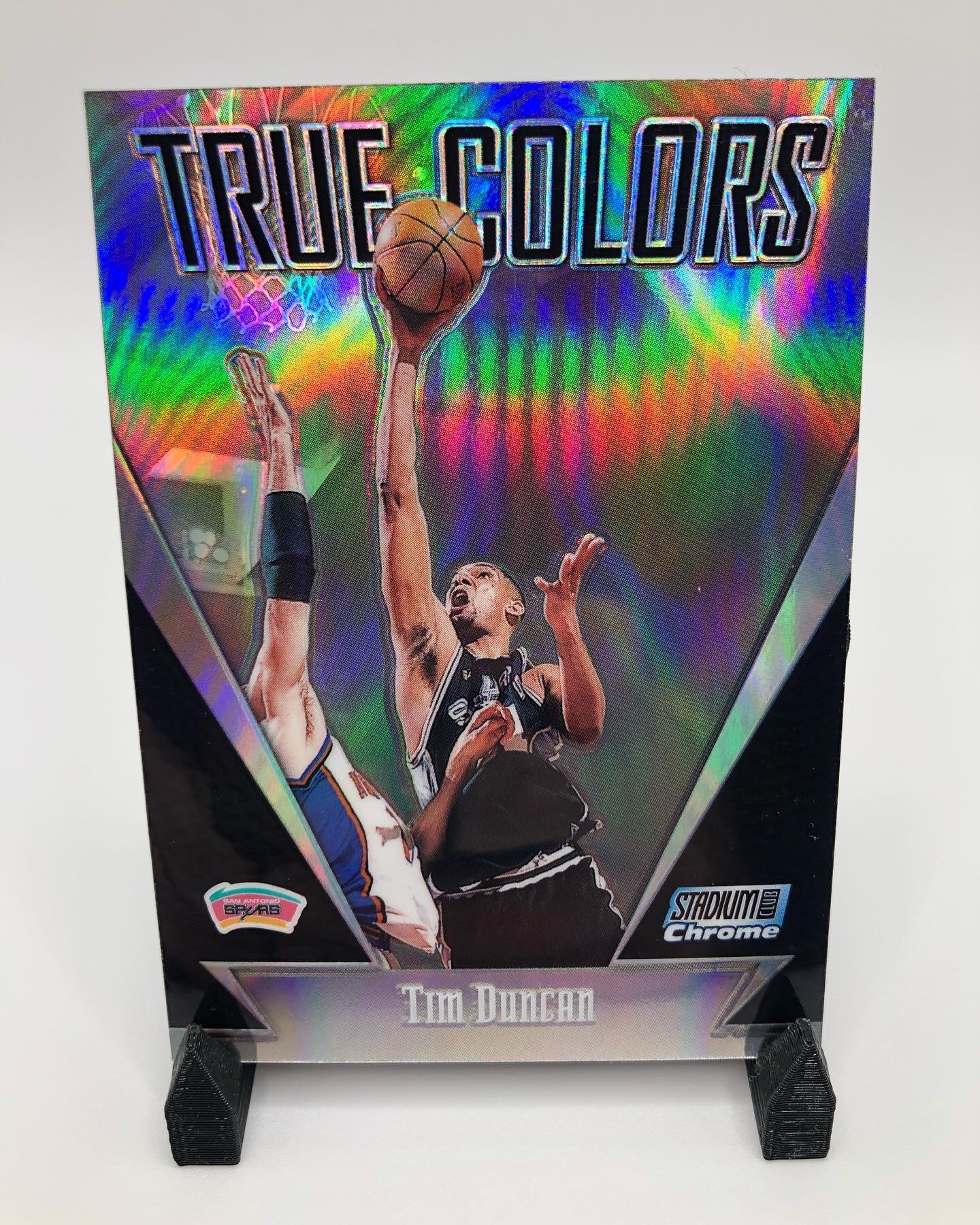
True Colors from 1999-00 Stadium Club uses team colors really well with a clean design. This refractor version just adds to the color element.

In The Paint from 2000-01 Topps Chrome is one of those designs that uses an array of colors really well, both on the front and back. The refractor version would only amplify the effect and is definitely on my want list. Plus I always appreciate a big-man insert set. These were not easily pulls either at 1:60 hobby packs.
Sometimes a parallel or insert design just completely clashes with team colors, and honestly I tend to stay away from those cards. I’ve pulled my share over the years and my initial reaction to them is usually not positive.
Shine
Obviously adding shine, particularly to chrome/premium type cards, adds great appeal to a card, most often used in parallels.

I’ve always wanted to pick up a Reciprocal from 1998-99 Upper Deck Ionix. It’s preferred for me over the 1999-00 version for a couple of reasons. The shine on this parallel obviously adds to the appeal, and the fact that these are serial numbered to 750. The Spurs were meant for this Ionix set, because the team colors complement the design so well. This card hits on multiple elements.

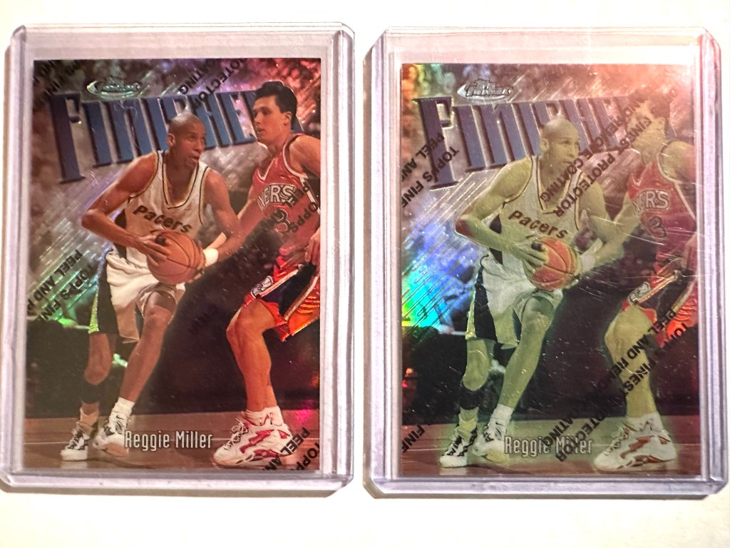
The go-to shiny cards for me, and for a lot of collectors are Topps Chrome refractors. They hold up and the collectability and demand for these cards continue to increase as years go by, especially for the stars. The nostalgia factor is high here. What I like about the Chrome refractors compared to say, Prizm silvers for example, is that more of the background image is shown. The border takes up minimal space on the card. I love seeing Duncan lefty hook over the helpless defender.
Shimmer
Whatever you want to call it, a sparkle or shimmer element, when executed the right way, adds eye appeal to the set.
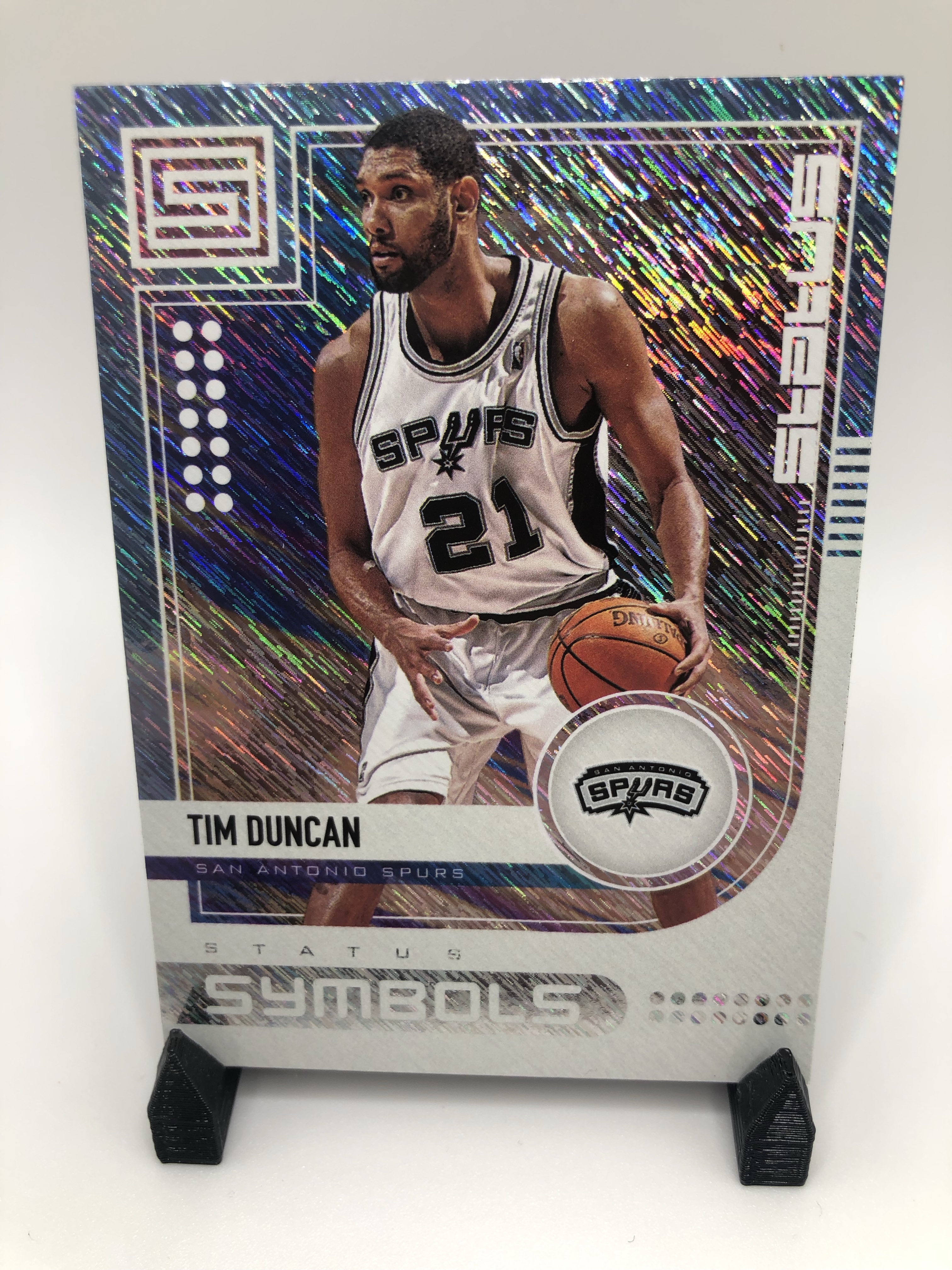
2019-20 Panini Status uses what I am calling the ‘shimmer’ element to perfection. It’s really a means for an array of colors to flow over the card.

The Trophy Club insert set uses the shimmer but to a lesser degree than Status Symbols. It’s still a focal point though, as the photo with Duncan and the championship trophies are relatively small compared to the shimmering border.
Acetate
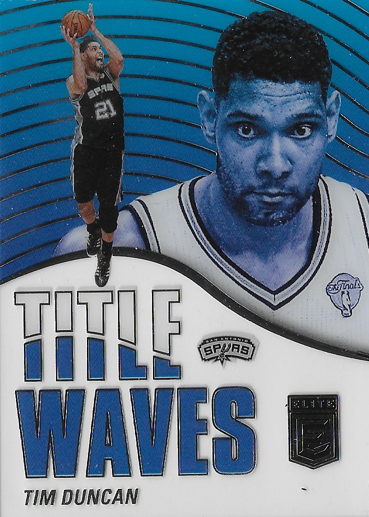
It’s hard to tell from the scan, but this Title Waves insert from 2021-22 Donruss Elite is an acetate card. It’s hard to explain the draw, but an acetate card just gives a premium feel. Often the card is heavier than a normal card. The E-X brand from the late 90s tops my list of acetate sets, but this Title Waves insert caught my eye.
Die-Cut
Some of my favorite insert sets have a die-cut element, and my recent Duncan personal collection adds reflect that preference. The scarcity aspect comes into play here, when you compare the number of sets that have a die-cut element to the ones that don’t, it’s a very small percentage, and that’s part of the appeal.
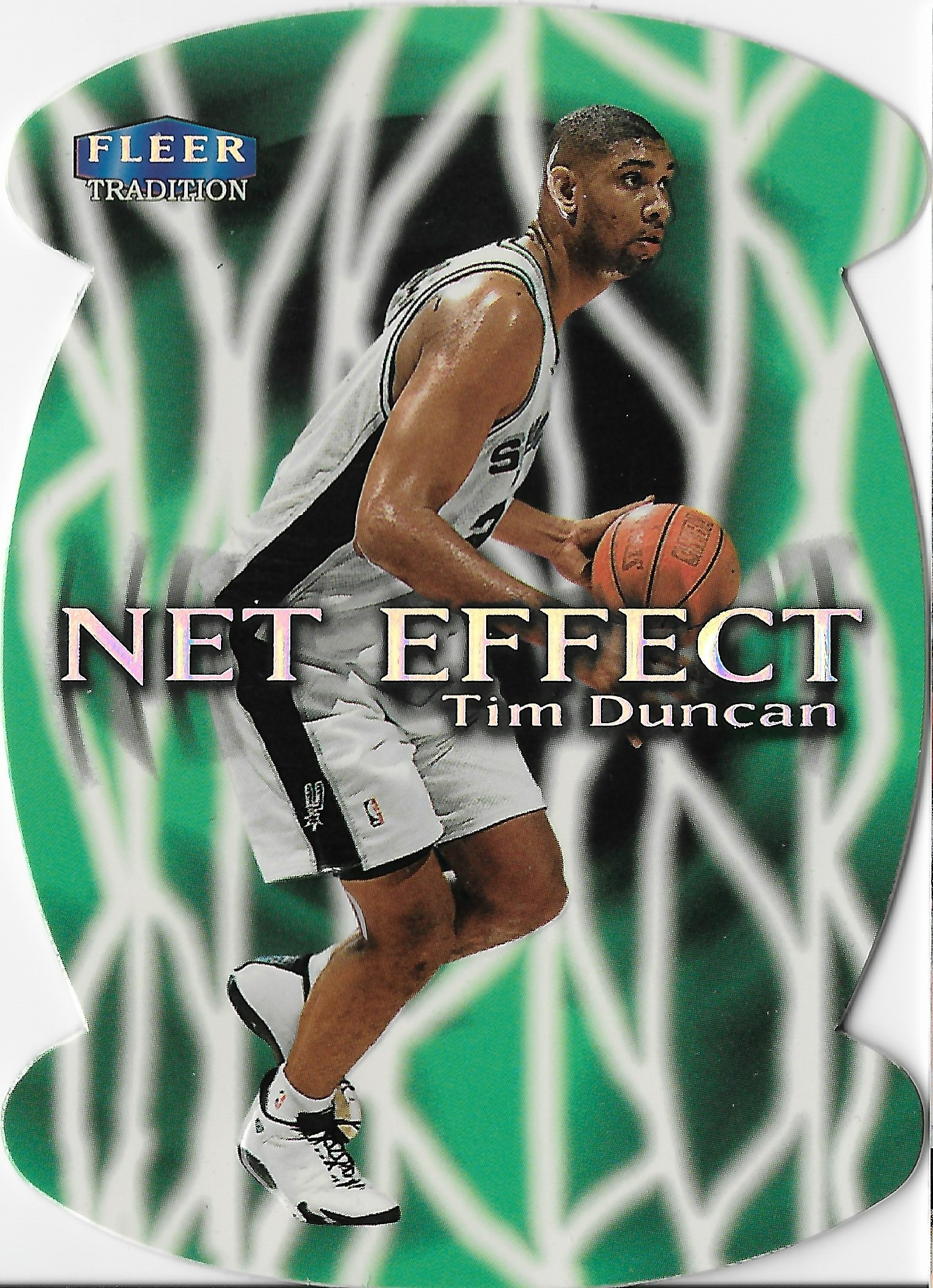
I had the Net Effect Duncan on my want list for awhile, and I waited until I found it for the right price to add it to my collection. Not only is it die-cut, but it has a 3D textured element on the player as well.
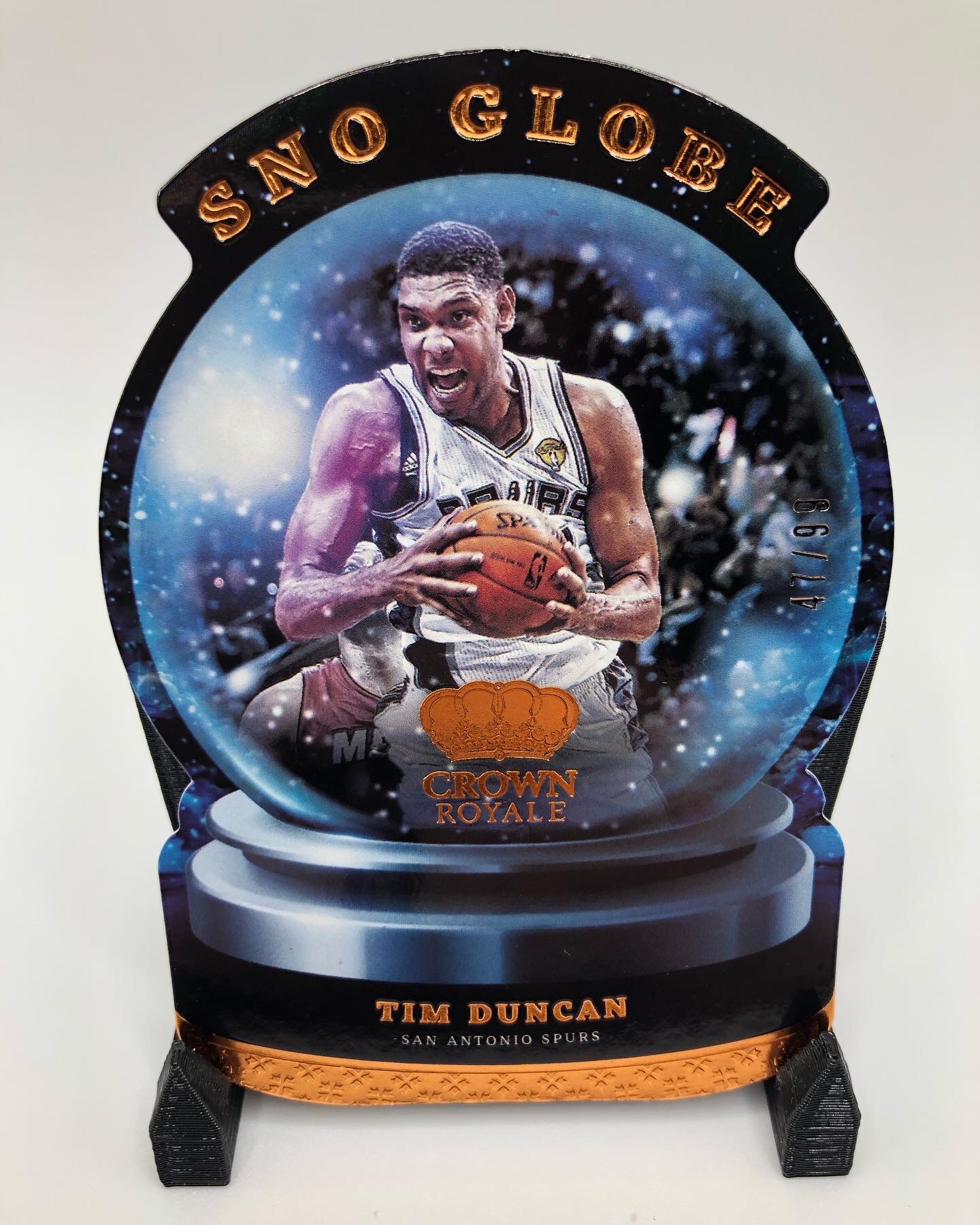
When I do see new sets release with a die-cut Duncan, that card immediately goes on my collecting radar, my eBay watchlist, my alerts, etc… It’s only a matter of time, and the Sno Globe insert from 2021-22 Crown Royale is the latest die-cut addition.
Scarcity
Even when other design elements are lacking, scarcity can often be the leading factor in making a set desirable. Whether it’s a lower serial number, being labeled a ‘case hit’, or having difficult labeled pack odds, these cards are in demand.
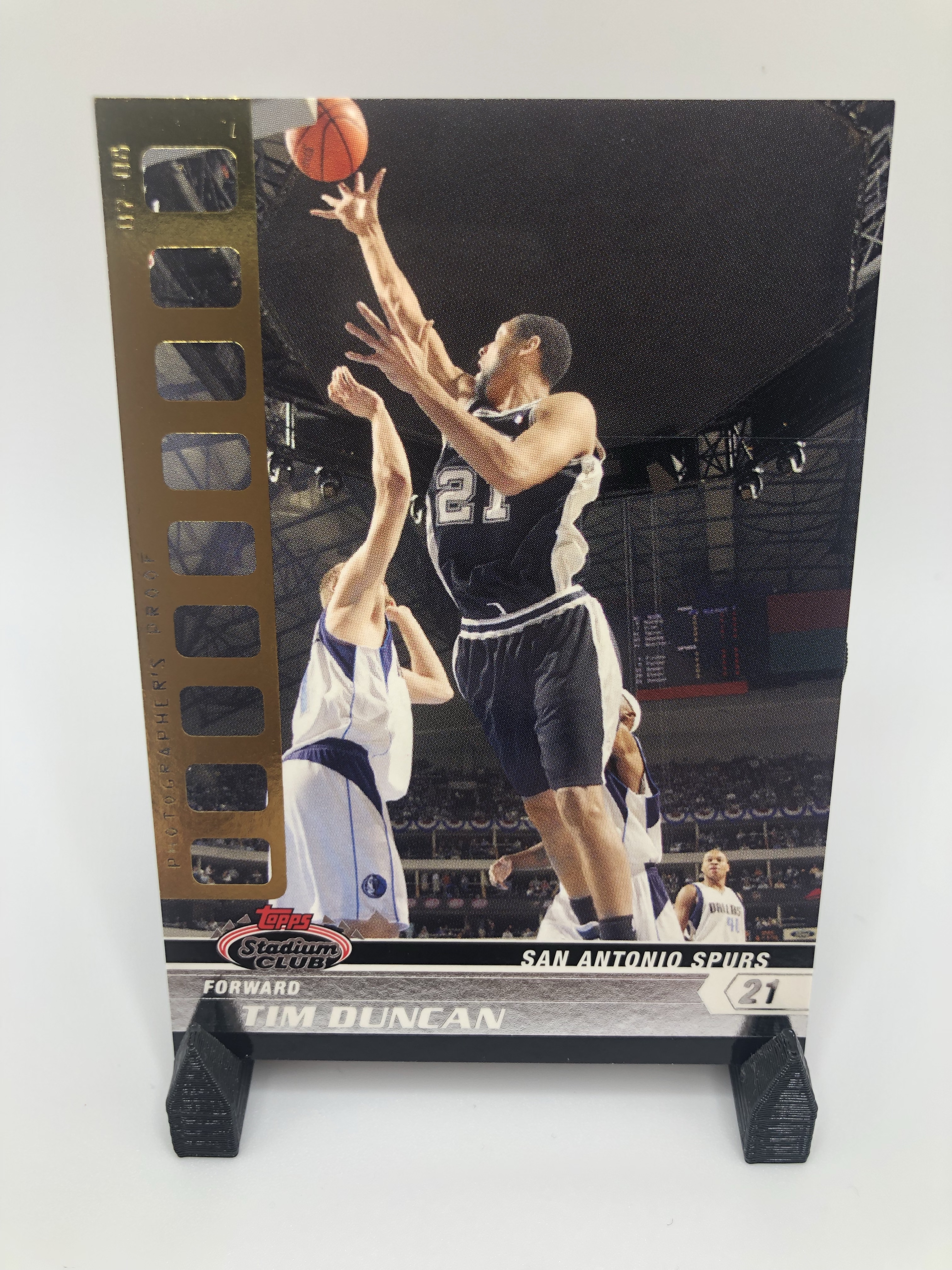
I’m a fan of this Photographer’s Proof parallel numbered out of 50, but mainly because I like the base set design with it’s simple, nostalgic Stadium Club logo, with a modern element underneath. The golden film strip on the left doesn’t take away from the photography, but it does let you know that this is no base card.
Summary

I’m wrapping up with this 2000-01 Bowman’s Best Elements of the Game insert, because it’s my favorite out of the whole lot. Look at all the elements that make one of the all-time greats.
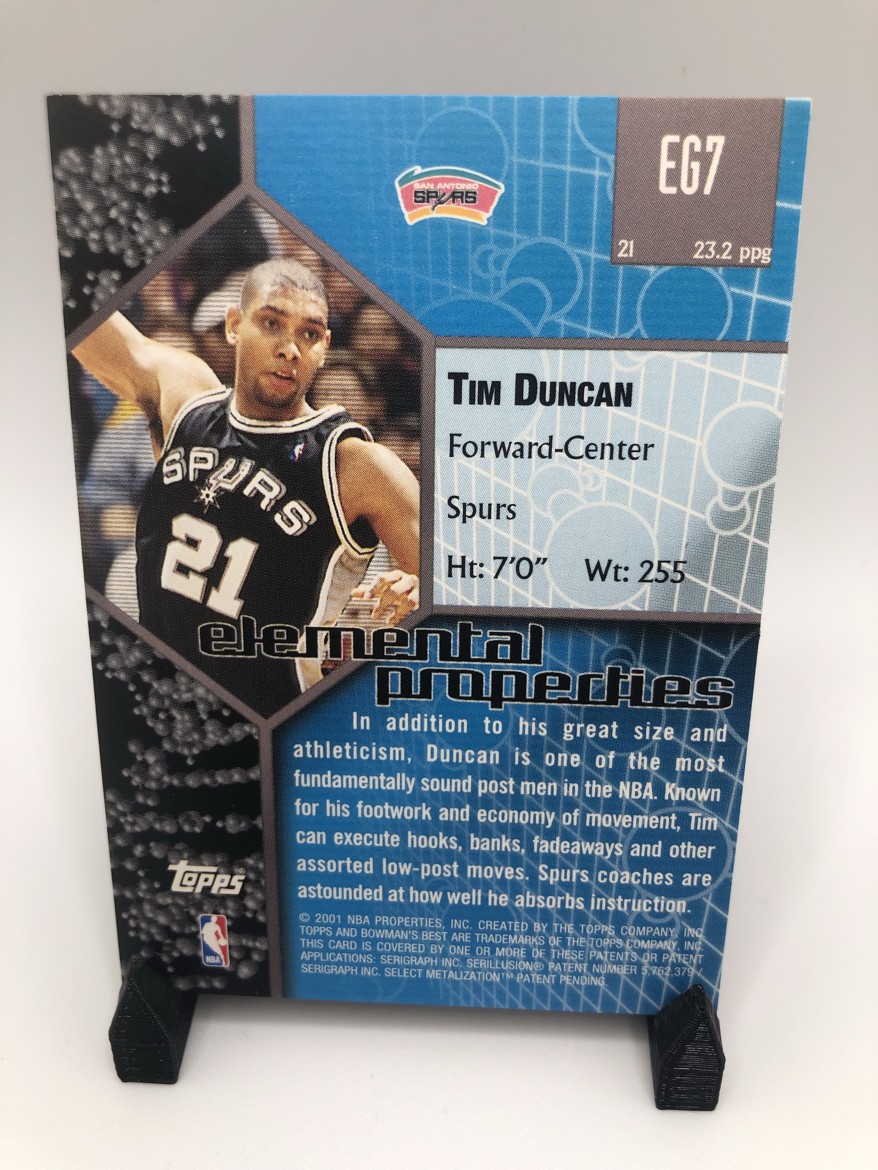
I thought the back of this one showing a young Timmy D and talking about his elemental properties was interesting enough to share. Elemental Properties could have been a follow-up insert set. The thought and effort put into the back of this set is impressive to me here.
What’s the most important design element in your mind and why is it shine? Which carries the most weight for you?


Leave a comment