In the ‘ultra-modern’ collecting period we’re in now, as it’s being called, most products, even the lower end products, have a seemingly endless number of parallels, along with numerous insert sets that usually have several parallel versions of those inserts. It can be overwhelming to keep up with, at times, for the team and player, and even set collectors out there.
Luckily, it’s easy enough to ignore all the noise and search out products and sets that appeal to your collecting interests. For me, it’s often the simple designs.

That’s better. Sharp, clean design showing a full image of the player in color with a black and white background. One of my favorite insert designs ever, and it comes from a low-end product in 2000-01 Fleer Tradition. The insert has a premium feel even though it’s from the cheapest Fleer Product from that year. The Kobe is the most expensive from this set, but even it can be found for under $15.
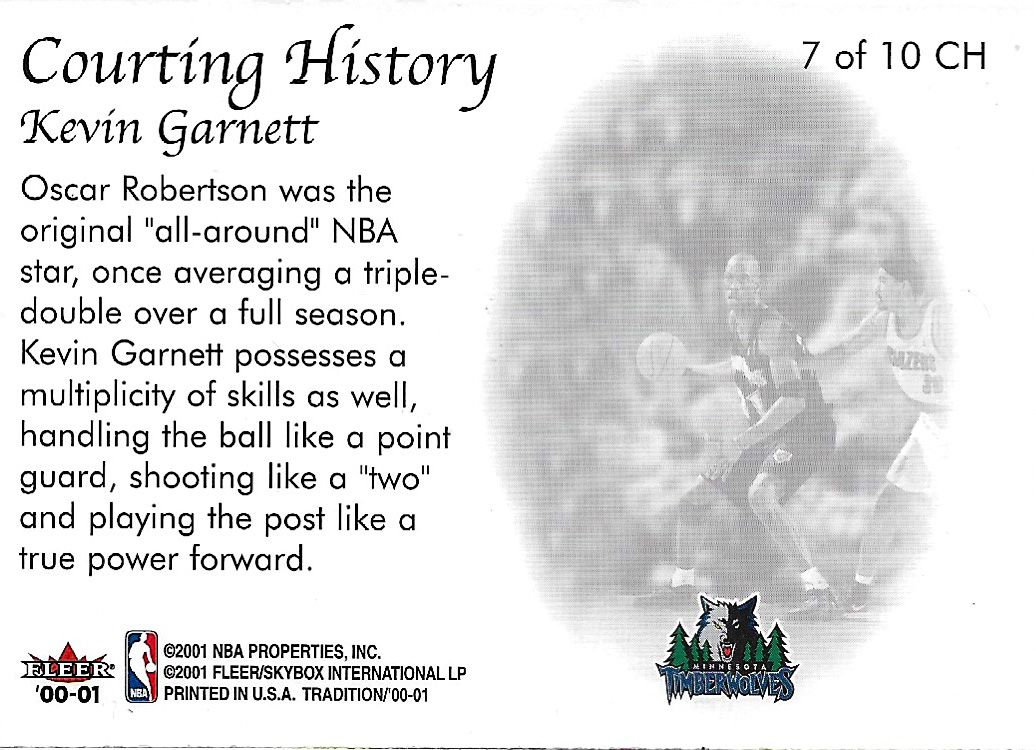
The back uses the same image from the front, but is also as aesthetically pleasing as the front. The checklist includes all of the major names you’d expect from stars from the late 90s and early 2000s, including the two biggest rookies from the previous year, Elton Brand and Steve Francis.

Sharpshooters, also from 2000-01 Fleer Tradition, is just as pleasing to the eye as Courting History. The only thing that bugs me just a bit on this design is the white space in the bottom left corner of the card. Maybe the team logo going in that space instead of overlaying the photo would be a bit better?
I appreciate that they included some big men as well. Duncan isn’t a three-point specialist, but his field goal percentage speaks for itself, and his patented bank shot hasn’t been replicated.
Either way, I love the action shots, the consistent border, and the fact that Sharpshooters has a history in Fleer sets, going back to 1992-93 Fleer. Sharpshooters as an insert set appeared for three years in the early 90s, last appearing in 1994-95, before making its return in 2000-01 Fleer Tradition. Sharp Shooters, two words, came back again in 2008-09 Fleer.

Same as Courting History, the same image is used on the front and back of the card. The white space is still obvious here too, but not quite as impactful. Overall, a solid, simple design.
What’s your favorite simple card design?


Leave a comment