To me, 2010-11 Donruss is the peak Donruss set from the Panini era coming to an end here later this year. The design can’t be beat. Action photos for most, some rookies excluded, no border or overwhelming design elements, solid card stock, and a classic look of a card back with multiple years of stats with a write-up of the player. Large base set of 295 cards. Team checklist cards. In my mind, Panini nailed it with this base set as well as the parallel structure, which I will touch on as well.

We also didn’t get another Donruss set following this one until 2014-15, and the whole parallel structure changed. It matched the look of the non-licensed baseball set, did away with die-cut parallels of the base set, added a border and minimized the game images. While there are things about 2014-15 Donruss that I like, I much prefer the base set and base set parallels from 2010-11.
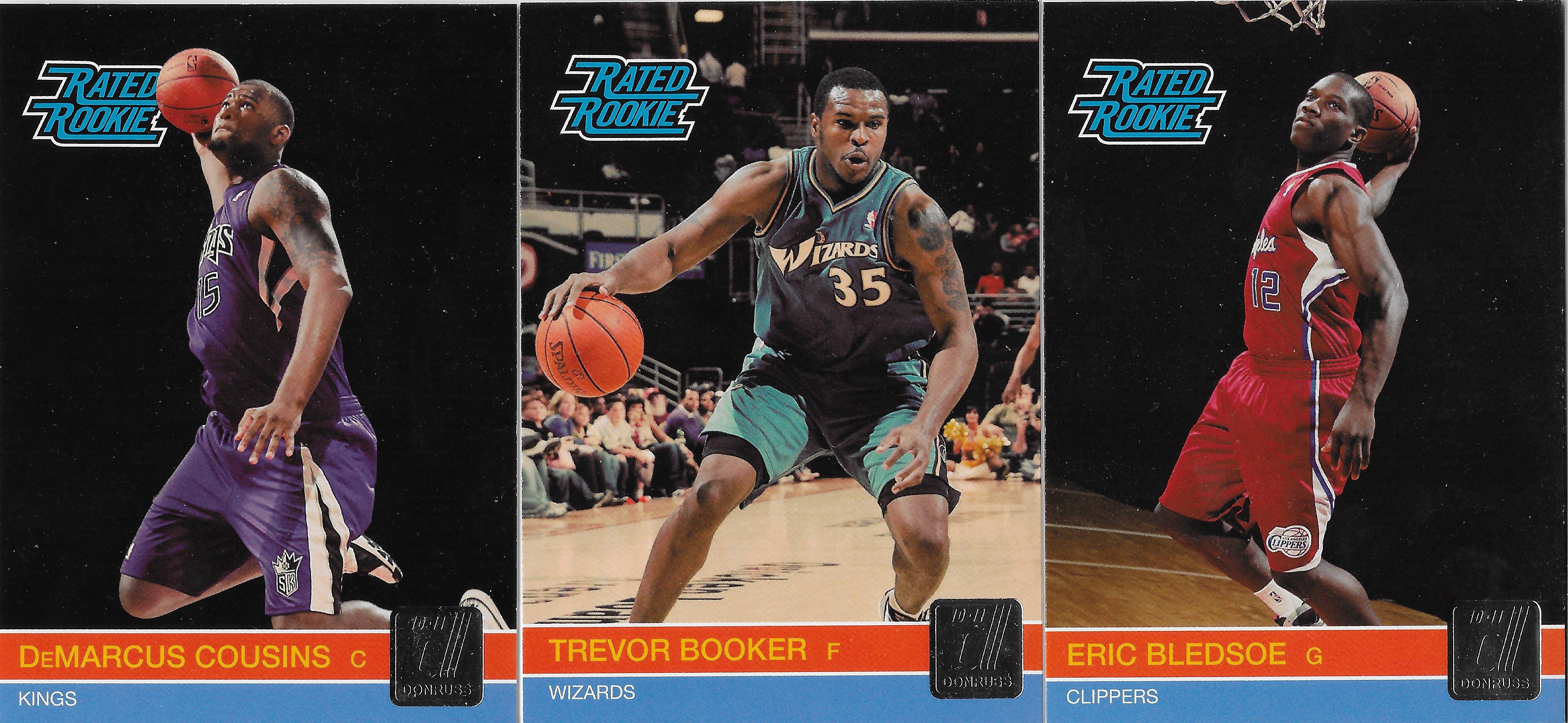
Some rookies have a photo shoot look while others are action photos. Many of the photo shoot photos have the players looking to slam, including top pick John Wall, which is a pretty awesome looking card that I’ve shared on the blog before.
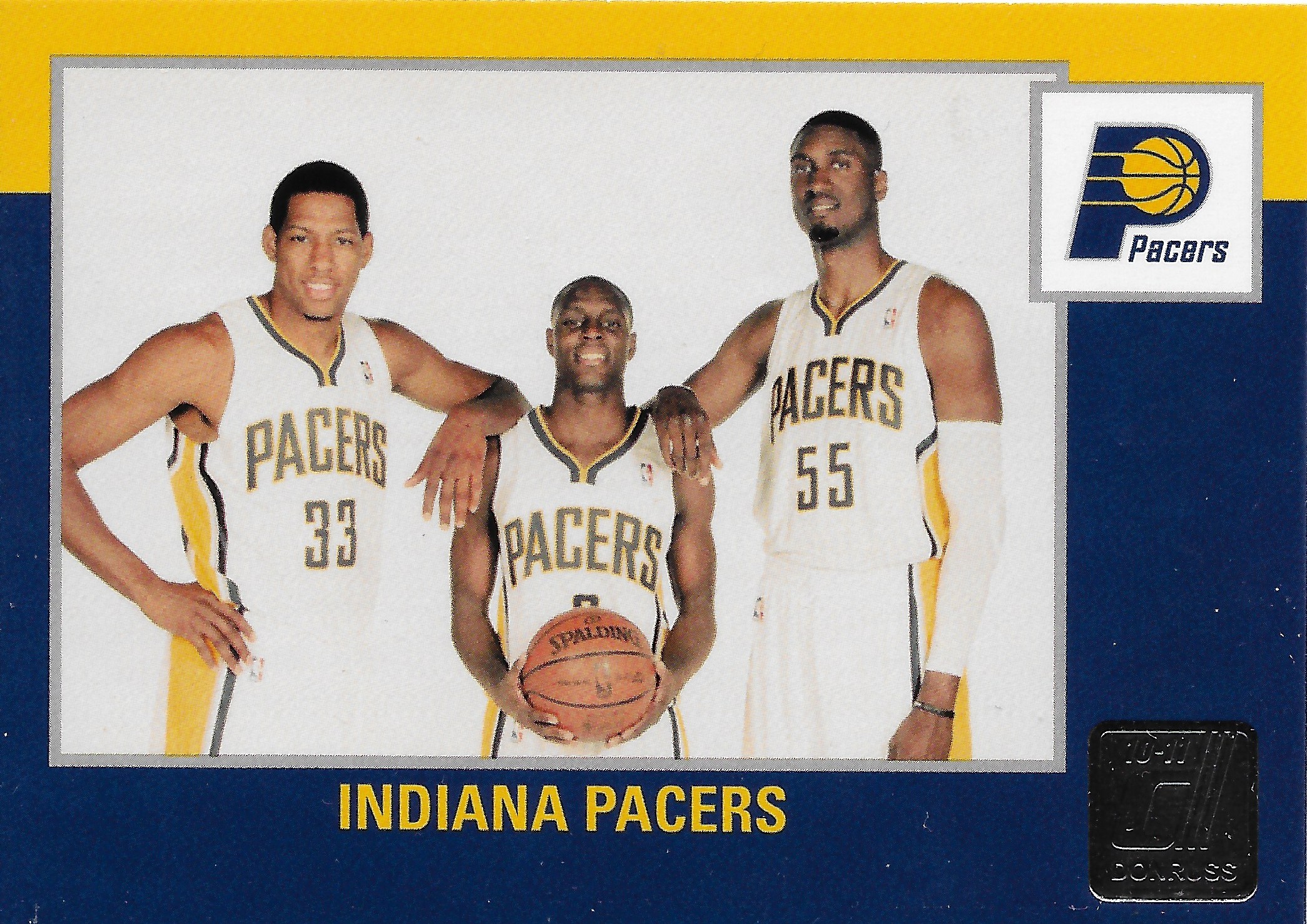
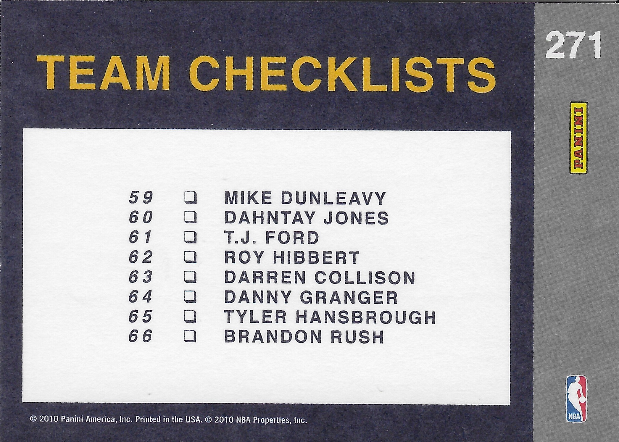
Here’s an example of the team checklist, and of course the one I have is the Pacers. A type of card you don’t see much anymore, but what an awesome photo and clean design. If that photo doesn’t flash me back to that early 2010s Pacers team, nothing will.
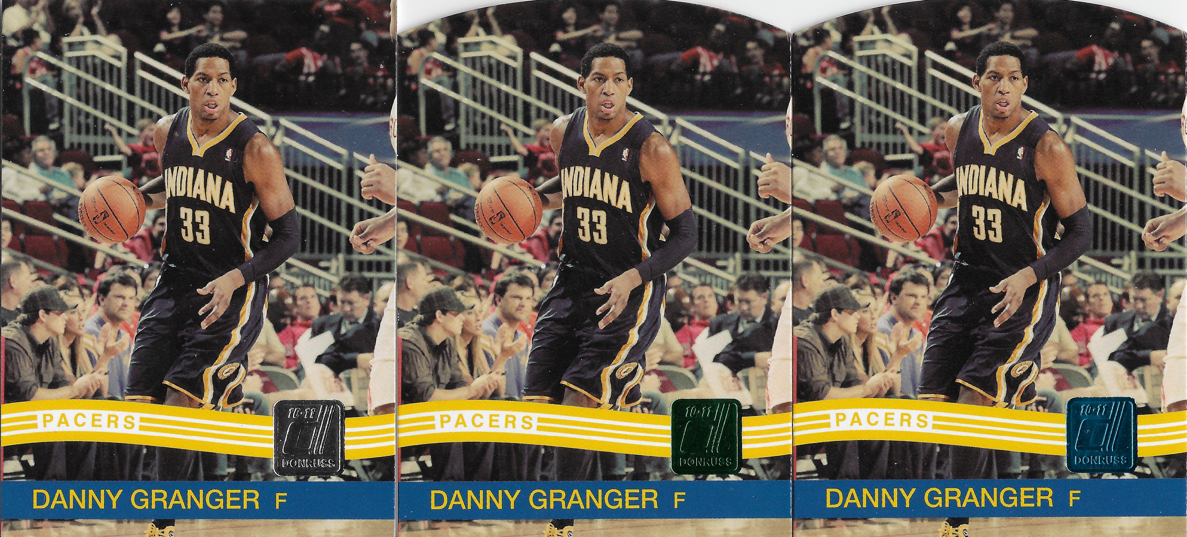
The parallel structure is simple, and I tend to favor simple in this hobby. Three levels of die-cut parallels, with the Emerald being unnumbered, the Sapphire out of 49, and the Ruby out of 25. The foil that indicates the type of parallel doesn’t take over a card in the way the lasers or prizm parallels can be in modern day (not always a bad thing) , which makes cards that don’t color match a non-issue in my mind.
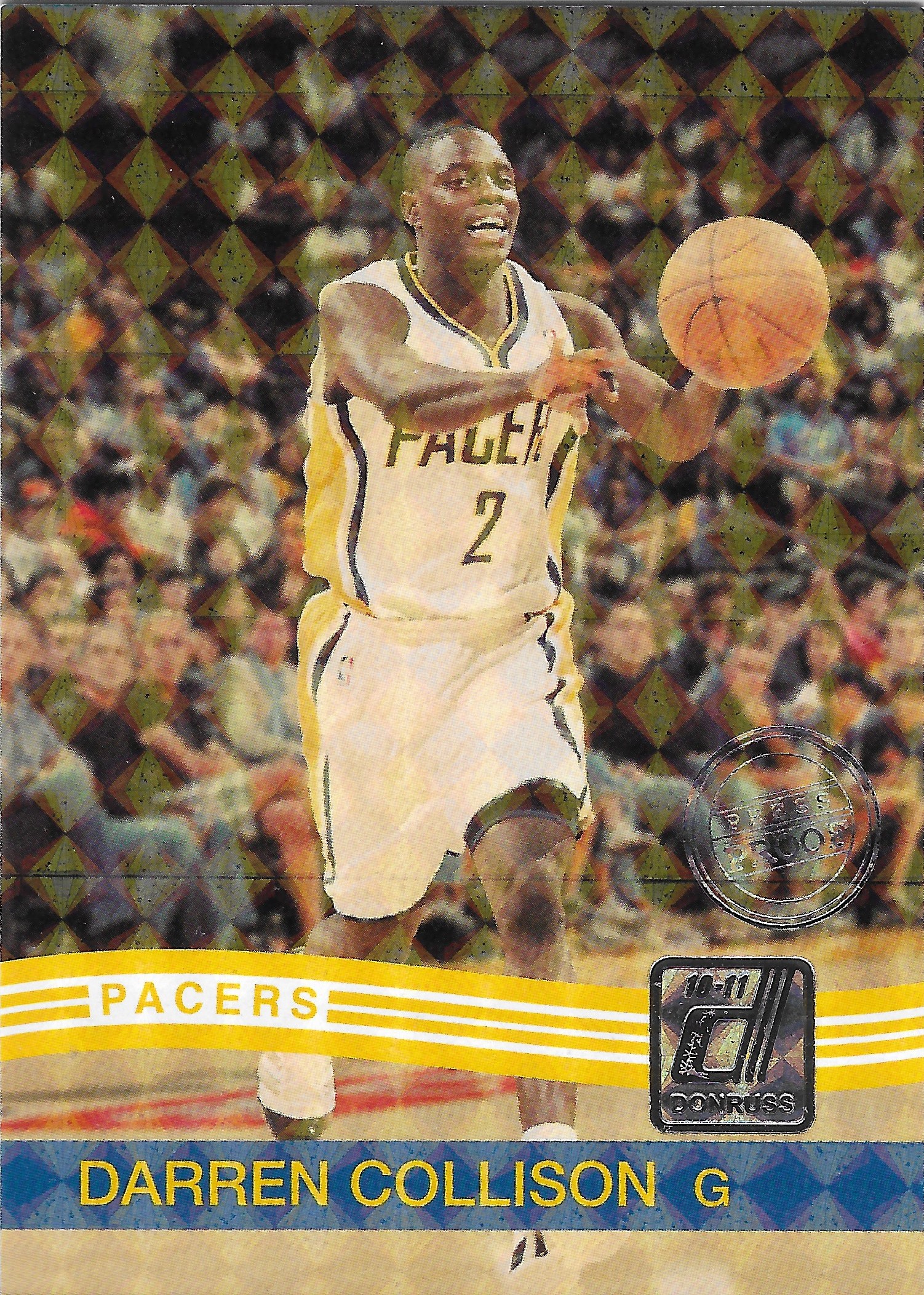
The Press Proof though, out of 100, is my favorite parallel from the product. It has the checkboard look that in the right light makes it almost look like a vinyl parallel. It has the Press Proof stamp that is used in future Panini products for continuity. But really it just enhances the base card design. You can still see the entirety of the action photo.
The only parallel I miss from other versions of Donruss is the ‘Status’ parallel. The 2015-16 version is one of my favorite parallels from the Panini era with the die-cut and team color scheme on the border.
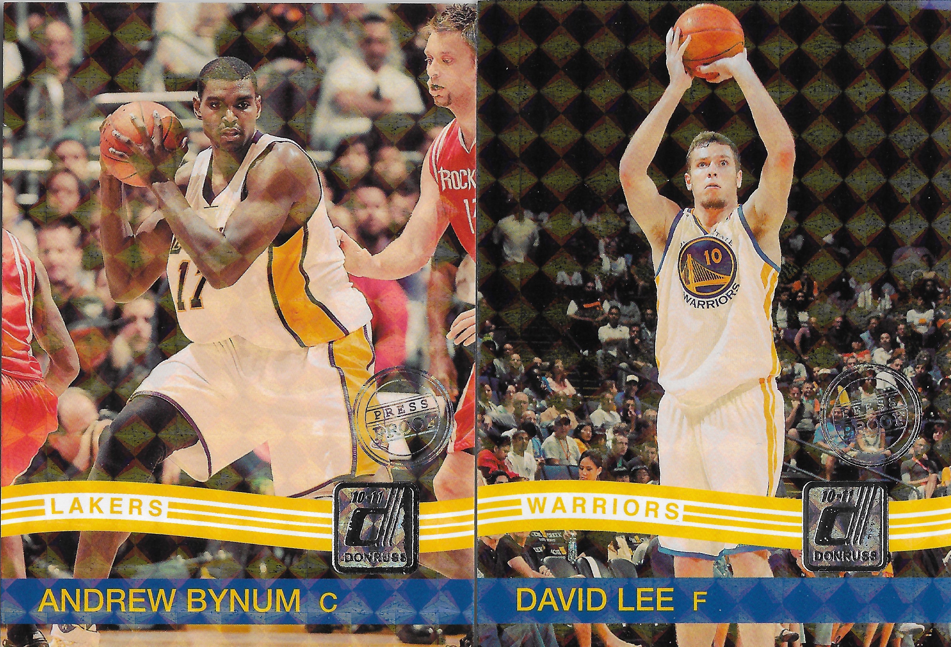
Here are a couple more Press Proof parallels that I pulled myself. One thing I noticed with these in hand is how the pattern extends over the Donruss and Press Proof logos, as well. This is just one of my absolute favorite parallels from the Panini era.

I recently shared this on my Instagram, but I also really appreciate autograph versions of the base set. 6 Pacers are included in this release, included a now very expensive Paul George autograph. So far I just have the Dunleavy autograph above. The print runs on these range from 399 for the PG rookie, down to 25 for Darren Collison and Danny Granger.
Most, but not all of the standard versions of the inserts are serial numbered /999, and have the same four tiers of parallels, with the Emerald (not numbered), Sapphire /49, Ruby /25, and the Press Proofs /100.

In addition, most (Duos insert is except) of the inserts have memorabilia and autograph versions, as well as a Prime mem version. This is the kind of parallel structure I can get behind, a low number of parallels of varying rarity, and memorabilia versions with game worn jersey swatches and patch swatches. Simple, but effective product.
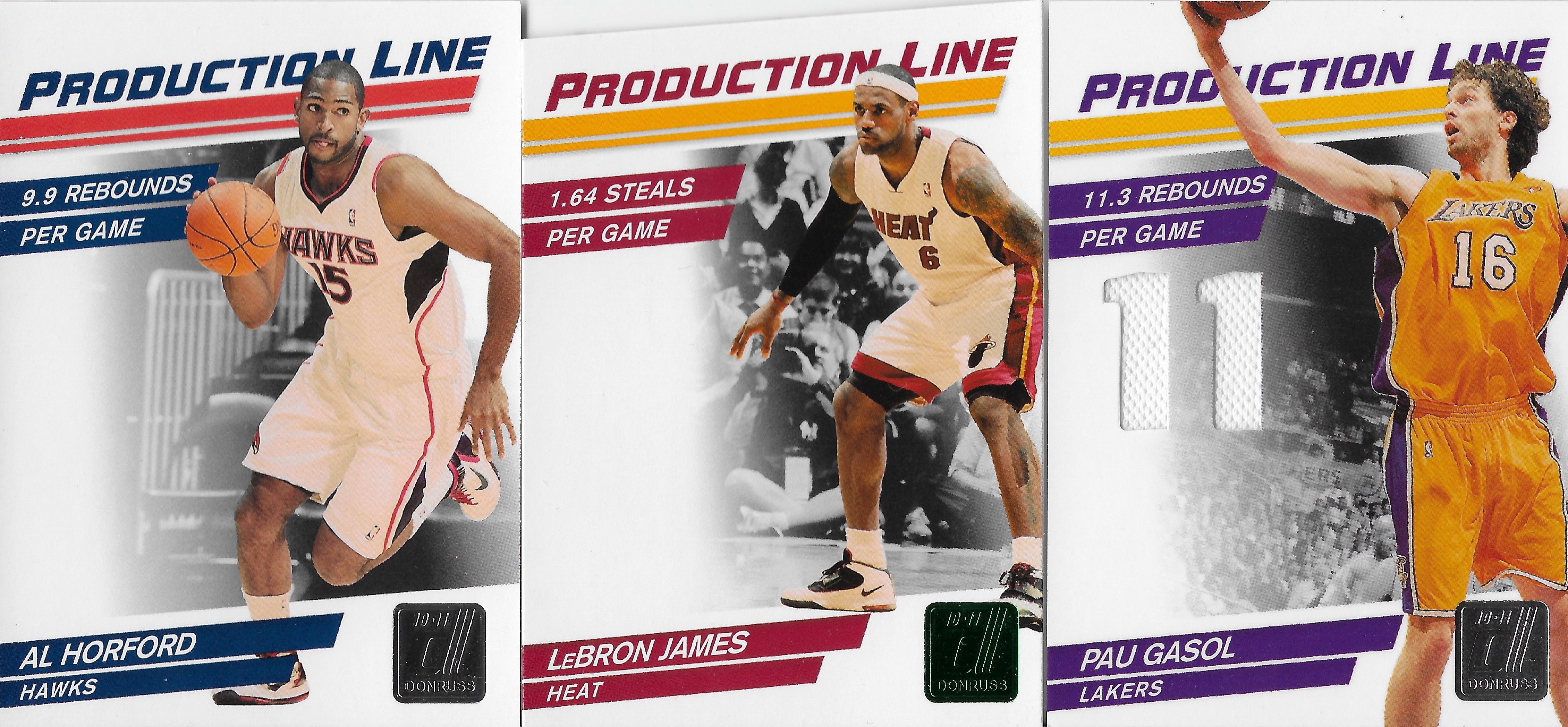
The Horford is a regular Production Line insert with a print run off 999. The LeBron is a die-cut Emerald parallel, unnumbered, and the Gasol is the memorabilia version out of 399.

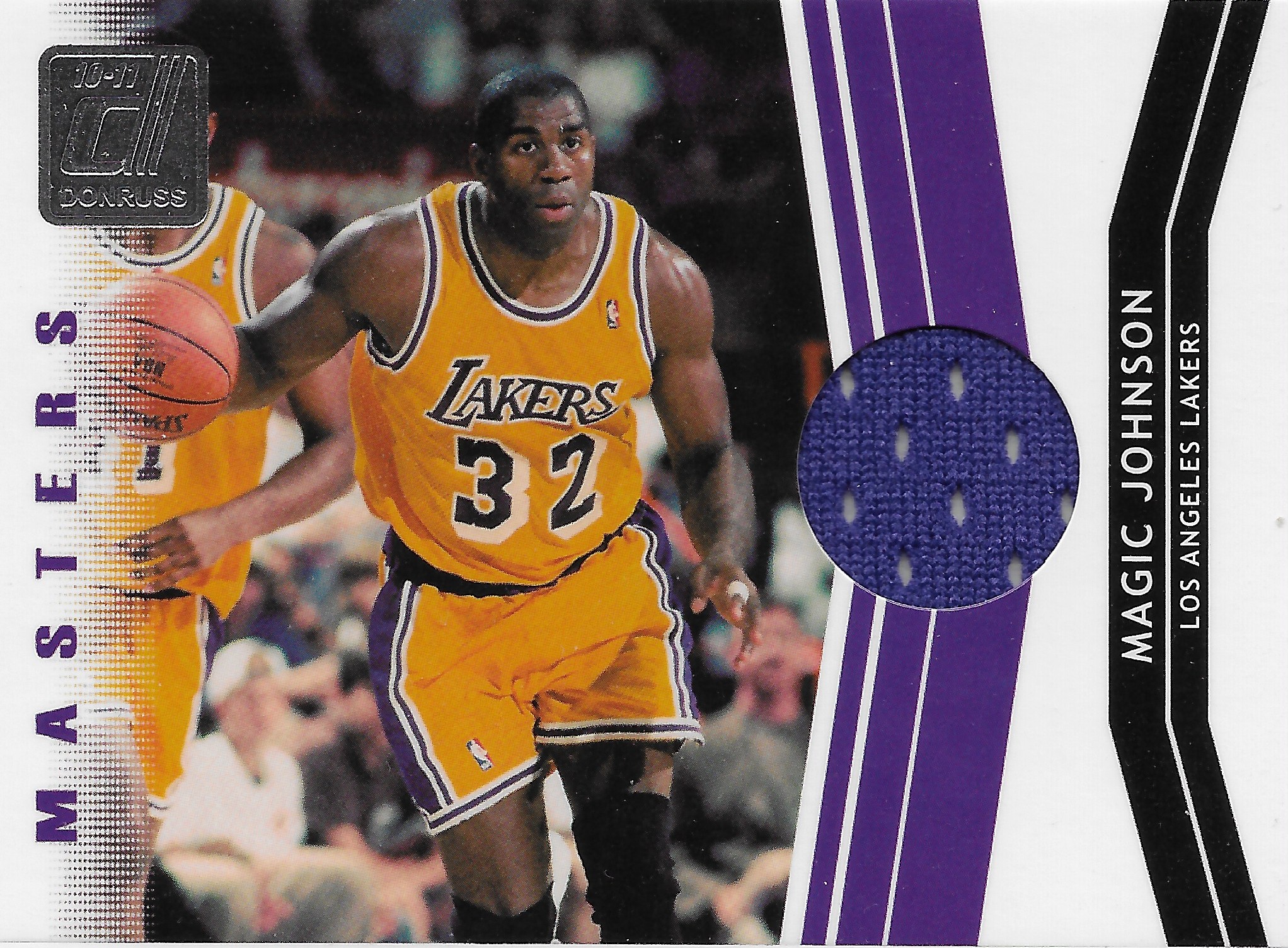
Out of the packs I opened back near time of release, I was fortunate enough to open memorabilia cards of Magic Johnson and John Stockton. What a point guard duo there! Both of these have a slightly lower print run than the Gasol, out of 299.
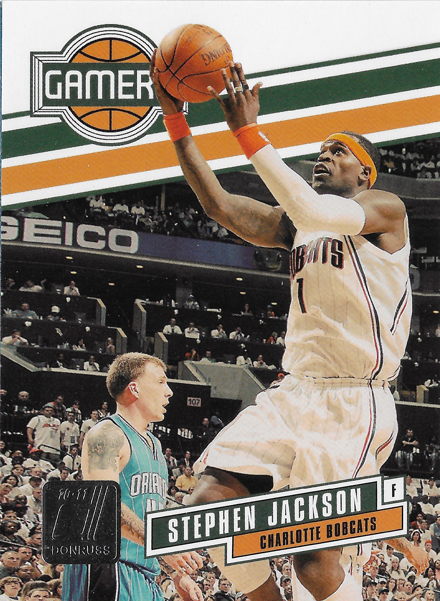
The designs on the inserts don’t blow me away, but I do appreciate the action shots mostly being used on the inserts. They’re also no worse than the inserts of today’s Donruss products. The only complaint I have on the inserts is that there isn’t a rookie dedicated insert set, or even a second year dedicated insert set. However when you go down that path, you possibly remove the option of having game worn versions of the cards when you’re talking about rookie-year cards.
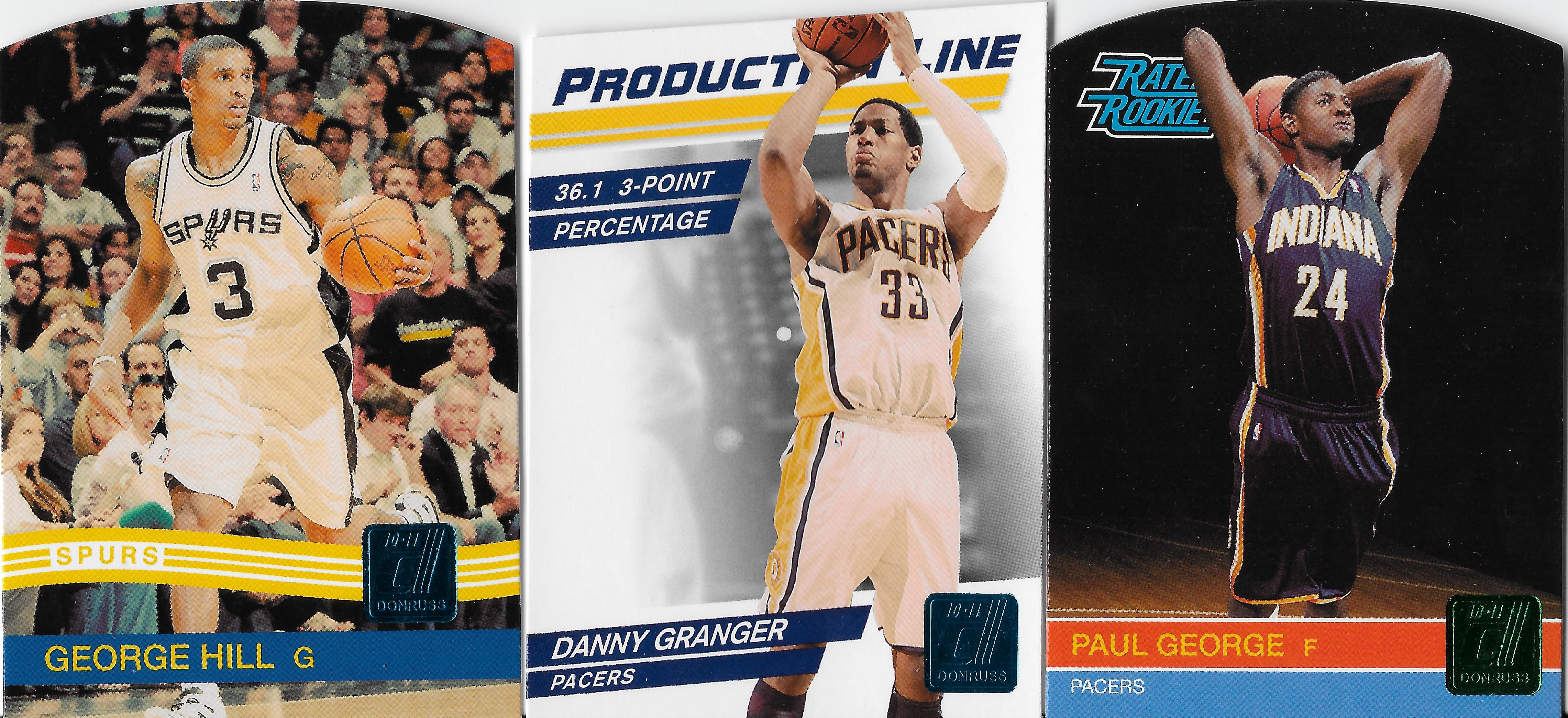
I’ll finish up by sharing a few of my favorite Pacers from my collection. The George Hill and Granger are the Sapphire /49, while the Paul George is a rookie Emerald unnumbered. The numbered versions of the Paul George, particularly that Press Proof, are pretty expensive these days. Wishing I had tracked down a copy of that Press Proof years ago.
Let me know what you think about this parallel structure for both the base set and the parallels. It seems we are too far gone to return to a parallel structure with this few versions, and this product is missing 1/1s of the base cards and even Golds /10, but even with those types of cards added, the parallels would not be too much to attempt a rainbow (minus 1/1) of a player.
With Donruss having its likely last release in the near future, how does the 2010-11 product rank among releases for you?
I am thinking along with 2010-11, the 2016-17 product is up there because of the design that goes along with 2016-17 Optic, the first year of that product. It also introduces the Lasers parallels but not to an absurd degree. That base design is also one of the best of the line. 2015-16 is up near the top as well, so that would be my top 3, in no definitive order.


Leave a comment